10% Off Use Code SAVE10 | FREE Shipping Orders $50+ | Overnight Delivery | Ships Same Day
10% Off: SAVE10 | FREE Shipping Orders $50+
Order Online Or Call Now +1-877-958-1499
When businesses plan to use yard signs, one of the first design elements they think about is the color combinations. Yes, colors are important, but you should not disregard other design elements that can significantly influence the effectiveness of your yard signs, such as your fonts.
Whether you are advertising a garage sale or promoting a political candidate, selecting the best fonts is crucial for maximizing the impact of yard signs. The right fonts can increase legibility, improve viewing distance, and promote brand consistency.
Here are the top fonts for yard signs and their best use cases.
Sans serif fonts are characterized by their simplicity. They don’t have the small decorative lines (serif) at the end of the letters. Sans serif literally means “without serif.” Some of the most recognizable fonts in the world, including Arial and Helvetica, feature a sans serif typeface.
The lack of decorations in these fonts makes them ideal for creating clear, impactful messages that can be read from a distance. They offer a modern and uncluttered look that stands out in any environment. Here are the best sans serif fonts for yard signs and their best use cases:
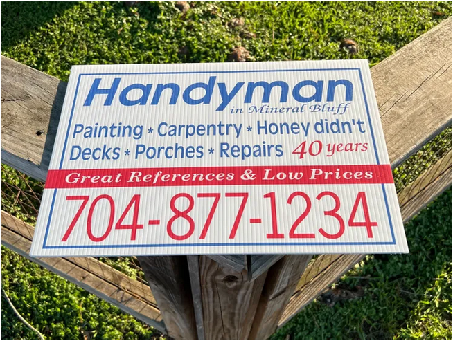
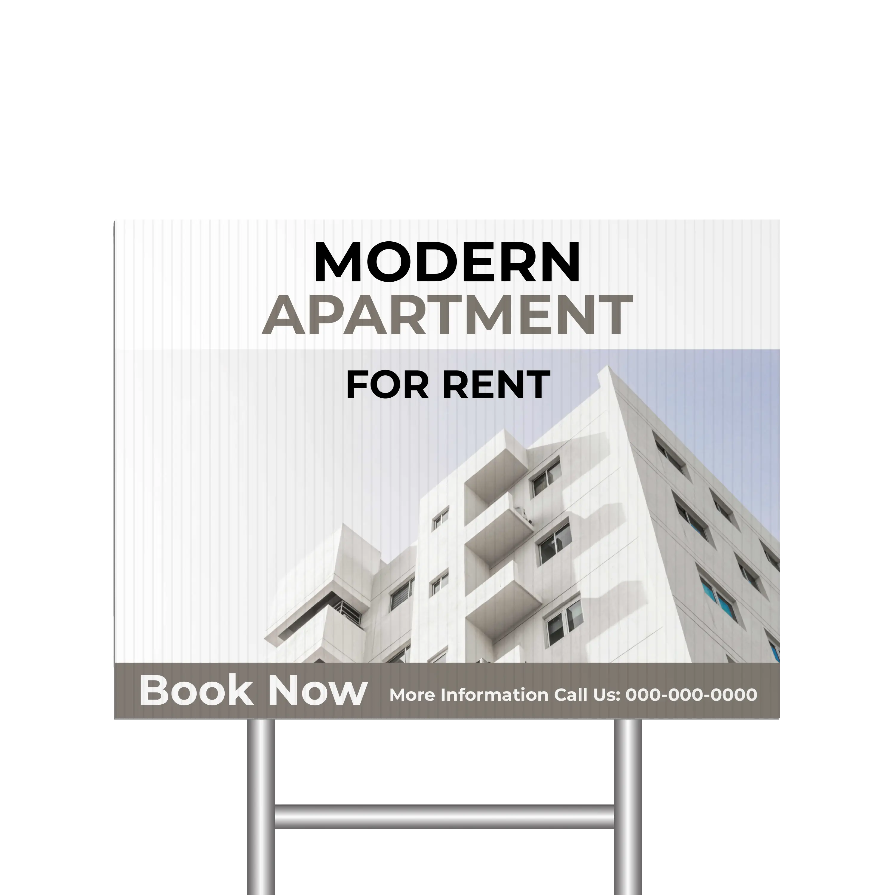
Arial: General announcements and event signs have superior legibility with Arial. It’s also a widely accessible font, making it a reliable choice every time.
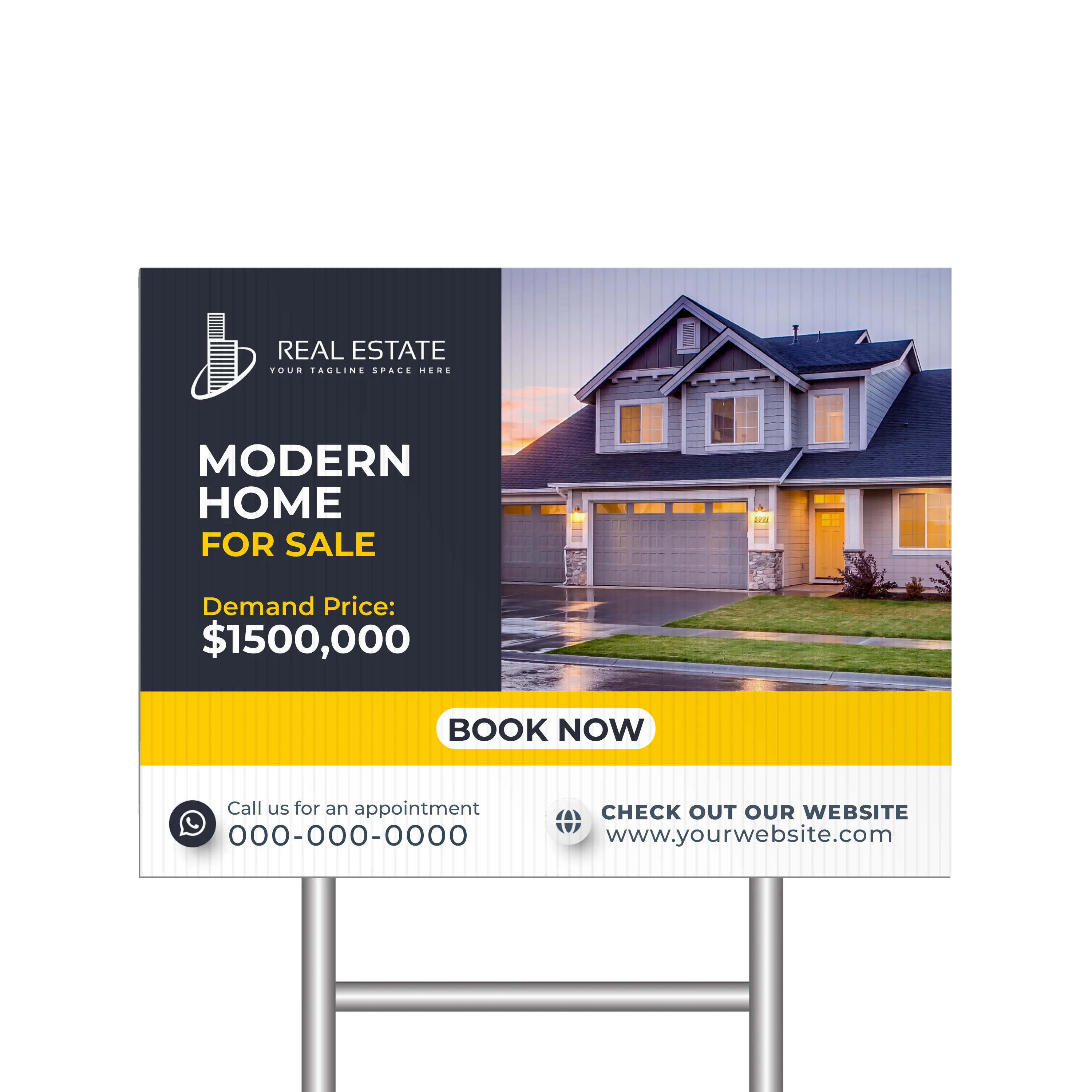
Gotham: Bold statements and political campaigns stand out in Gotham’s strong and clear lines. This sans serif font just oozes authority and confidence.
Open Sans: Retail promotions and sales announcements are more inviting with Open Sans. Its neutral look makes it a very versatile font.
At Yard Sign Plus, you can customize our yard sign designs to suit your requirements. We have a wide variety of fonts available to boost your message’s readability. Arial, Gotham, and Open Sans are just some of our sans serif fonts.
These fonts have small decorative lines (serif) at the end of the letters. These small strokes give the fonts a more classic, formal, and traditional appearance.
The serifs lead the eye from one letter to the next, improving the readability of your yard signs. They are particularly helpful for longer blocks of text. The serifs are also decorative, adding a sense of elegance and sophistication to your message. Here are the best serif fonts and their best use cases:
Courier: Retro and vintage-themed promotions look perfect with Courier. The typewriter style adds a sense of charm and nostalgia.
Merriweather: Community notices and other informational signs are very readable with this serif font. This is all thanks to the font’s slightly condensed letterforms.
Times New Roman: Educational institutions and professional services look more authoritative and formal with this serif typeface. It is also one of the most recognizable fonts out there, giving a sense of reliability.
While you are customizing your yard sign design on our website, choose a serif font for a message that is both compelling and visually appealing. We have many styles of Courier and Merriweather, including Courier New and Merriweather Light.
|
Fun Fact: Times New Roman was commissioned by The Times newspaper in 1931 to improve readability and space efficiency in print. It has since become one of the most popular typefaces of all time. |
Script fonts are characterized by their cursive strokes, often mimicking the natural flow of handwriting with varied line thickness. They are ideal for conveying creativity, individuality, and warmth.
In yard signs, script fonts are best used for personalized messages such as congratulatory notes and special occasions such as birthday signs. Here are the best script fonts and their best use cases:
Dancing Script: Community events and public notices get a friendly tone with Dancing Script. The font’s design makes the message inviting and easy to read.
Lobster: Artistic displays and creative business ads are eye-catching with this script font. Lobster has thick letterforms that add a bold and creative flair.
Pacifico: Casual events and informal gathering signs look playful in Pacifico. The script typeface adds a fun and relaxed vibe for barbecues, family gatherings, kid parties, and more.
Check our birthday signs to see script fonts in action. We feature different styles of Dancing Script, Lobster, Pacifico, and other fonts that resemble calligraphic or handwritten text.
If your yard sign’s goal is to make a strong visual impression, display fonts are the way to go. These fonts often have bold lines and dramatic shapes that are perfect for conveying bold and unique statements.
When using different fonts in your yard signs, consider using these fonts for headlines and titles. Their distinctiveness makes any text stand out. Here are the best display fonts and their best use cases:
Cooper Black: Family gathering and fun event signs become even more fun with the Cooper Black. It has rounded bold letters that create a welcoming atmosphere just as effectively as a script font.
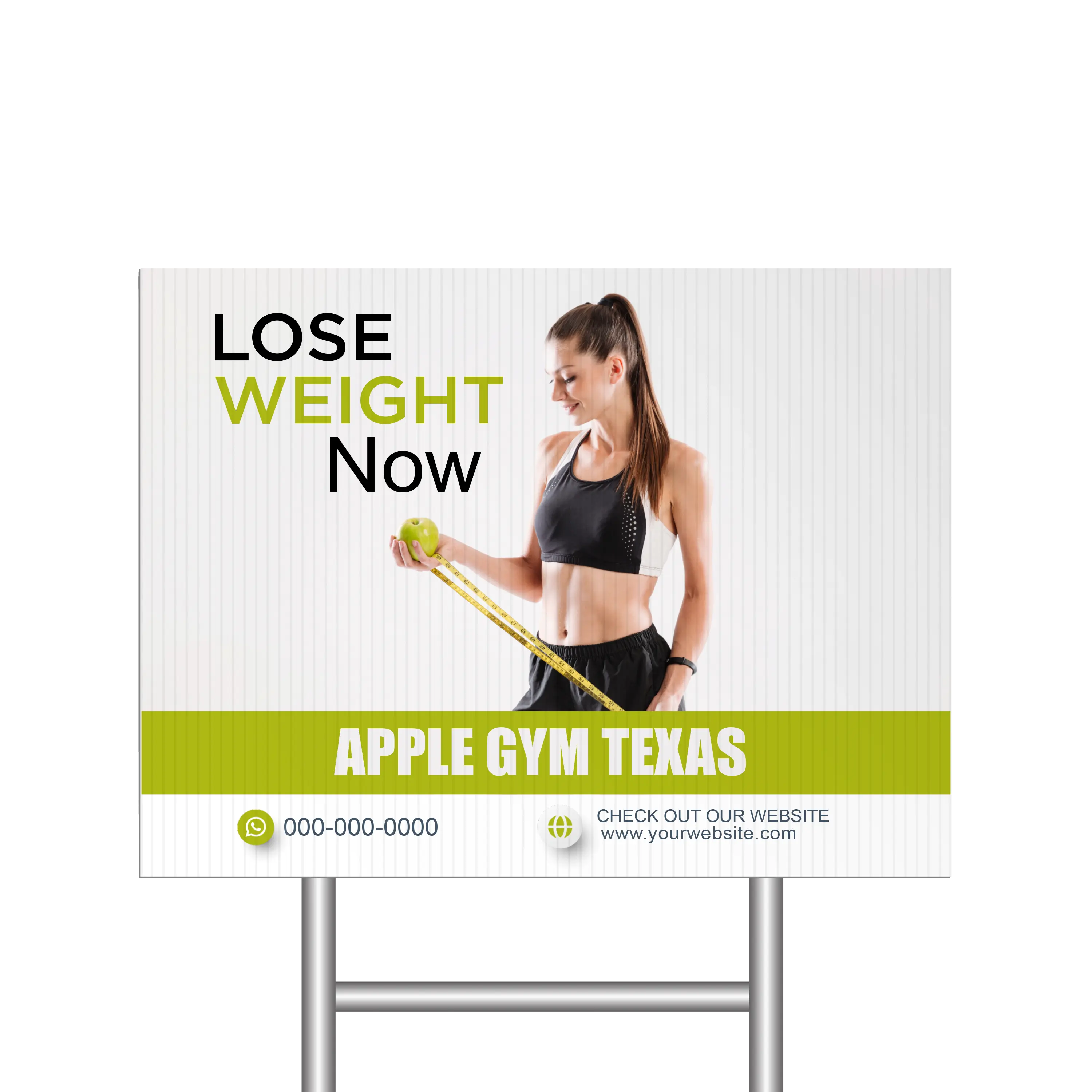
Impact: Sale signs are highly recognizable with the Impact display font. It is thick and narrow compared to other fonts, making it perfect for messages that need to be loud and clear. Its boldness also makes it perfect for political signs.
Rockwell: Professional service signage looks strong in this bold display font. It helps convey professionalism, reliability, and stability.
Use a display font for your political campaign signs to create a recognizable and memorable campaign brand. View our customizable political sign templates and see how a display font makes them more impactful.
|
Design Tip: Use font combinations to create a text hierarchy. For example, you can use a thick font such as Impact for your headlines and a thin font such as Arial for your details. This is an effective way to distinguish important information from supporting text. |
Rounded fonts have curved and smooth edges that give them a soft appearance. The rounded design elements make these fonts less formal. They are perfect for yard signs that want to convey a positive and friendly tone.
Use rounded fonts to ensure your message is conveyed in a warm and engaging manner. Here are the best rounded fonts and their best use cases:
Comic Sans: Children's event signs and playful notices become more approachable when you use Comic Sans. It is also a widely recognized font, giving a sense of familiarity and reliability.
Poppins: Modern retail promotions have a clean and approachable look with the geometric yet rounded design of Poppins.
Quicksand: Art fair and creative workshop signs get a more artistic feel with the Quicksand rounded font. It’s also designed to be legible even in small sizes, making it perfect for details.
Using uppercase letters can enhance the readability of your yard signs. When combined with a friendly and approachable font, you can create striking and inviting signage.
Geometric fonts use simple geometric shapes such as circles and squares to create letters. The geometric design gives them a clean and highly structured appearance, perfect for conveying a sense of order and balance.
These fonts are highly readable and visually appealing, making them flexible choices for a variety of yard signs. Here are the best geometric fonts and their best use cases:
Montserrat: Event signage and retail promotions are clear and visually appealing with the various Montserrat typefaces. The design of Montserrat is particularly modern.
Proxima Nova: Innovative business signs and tech-related promotions look uniform in Proxima Nova. This geometric and sans serif font bridges the gap between traditional and modern aesthetics.
Raleway: Art exhibitions and creative showcases are elegant and sophisticated in the Raleway font family. The various styles of Raleway, such as Raleway Regular and Raleway Black, are both structured and stylish.
Communicate your message in a clear, professional, and aesthetically pleasing manner with geometric fonts. At Yard Sign Plus, we have various styles of Montserrat and Raleway, ensuring you find the right geometric aesthetic for your graphic design.
Combining different typefaces within a single yard sign can create a dynamic and visually engaging design. For example, you can use a sans serif font for formality and add a rounded font into the mix to bring friendliness, making your yard sign both professional and approachable.
Here is a table featuring effective font pairings and their best use cases:
|
Typography |
Effect |
Best Use Case |
|
Montserrat and Comic Sans |
Montserrat’s modern appearance becomes friendlier with Comic Sans |
Children’s events and retail promotions |
|
Proxima Nova and Quicksand |
Professionalism and friendliness combine for a more balanced and inviting look |
Community events and tech-related promotions |
|
Raleway and Lobster |
Combine the thinness of Raleway and the boldness of Lobster to create a text hierarchy |
Art exhibitions and creative showcases with many details |
|
Helvetica and Pacifico |
Helvetica’s neutral appearance becomes more versatile with the playful Pacifico |
Creative workshops and professional services |
|
Times New Roman and Dancing Script |
Times New Roman’s traditional design is lightened by the lively Dancing Script |
Festive announcements and traditional services |
When mixing fonts, it’s important to ensure that the fonts you are using actually complement each other in terms of readability, style, and weight. This helps avoid a cluttered or disjointed appearance.
If you can’t find the font you need in our customizable yard sign designs, you can message us. We can accommodate your request and help create a custom design for you.
Choose fonts not just for aesthetics. Other factors besides aesthetics influence the effectiveness of your yard signs, such as the purpose of the signage itself, your target audience, and the place where the signs will be displayed.
Below is a quick guide on how to choose the perfect font according to your needs.
Information Delivery: Use clear and straightforward fonts such as Arial and Helvetica to convey information quickly.
Promotion and Attraction: Try bold and eye-catching fonts such as Impact and Lobster to draw attention to sales, special offers, and events.
Personal and Warm Messages: Choose fonts with cursive strokes and rounded edges, such as Dancing Script and Pacifico.
General Public: Stick with universally readable fonts such as sans serif fonts to ensure clarity for a wide audience. Arial, Gotham, and Open Sans are always reliable.
Youth and Family: Opt for playful and approachable fonts such as Comic Sans, Poppins, and Quicksand.
Professional and Formal: Go with serif fonts such as Courier, Merriweather, and Times New Roman for corporate messages and formal notices.
Far Viewing: Use display fonts such as Cooper Black, Impact, and Rockwell for roadside ads and other signs that are viewed from a distance.
Close-up Viewing: Geometric fonts such as Montserrat, Proxima Nova, and Raleway are perfect for details because of their clean and modern appearance.
Outdoor vs. Indoor Viewing: Use fonts with strong contrasts, such as Impact, for outdoor signs and soft fonts, such as Raleway, for indoor signs.
Effective signage combines readability, style, and context. By understanding the unique strengths of different fonts, you can craft yard signs that not only capture attention but also communicate your message effectively.
From the clean lines of sans serif fonts to the elegant curves of script fonts, each typeface brings unique qualities to your yard sign design. By carefully considering the purpose of your sign, your target audience, and the viewing environment, you can choose fonts that provide maximum impact.
At Yard Sign Plus, you can experiment with different fonts and font combinations, creating truly unique and impactful yard signs. Discover the different typefaces that take your designs to the next level. If you are not sure which fonts to use, simply send us a message.
We will gladly help you create a yard sign that perfectly aligns with your preferences and objectives.
Leave a comment